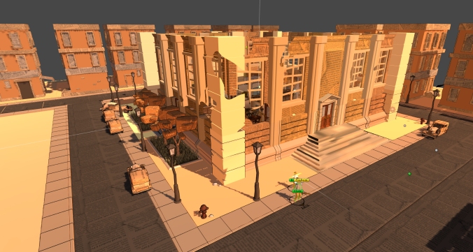
[ART] Over the bank wall
This week I finished working on the outer walls of the bank, so we can finish up on the outside.
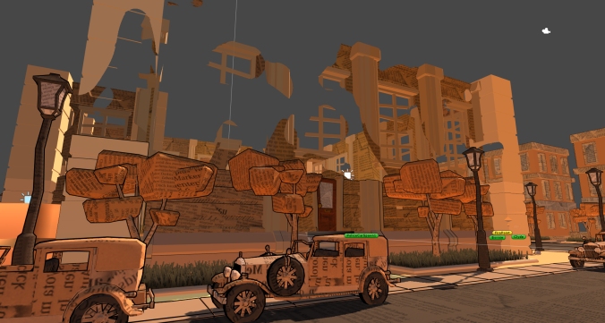
I had to rework the wall to fit our dissolve shader rendering style better and give a nicer finish to the bank.
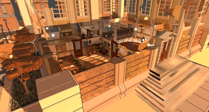
Now the top part of the walls dissolve and the bottom part stays, maintaining the look of the bank, but at the same time allowing the player to see in the bank.
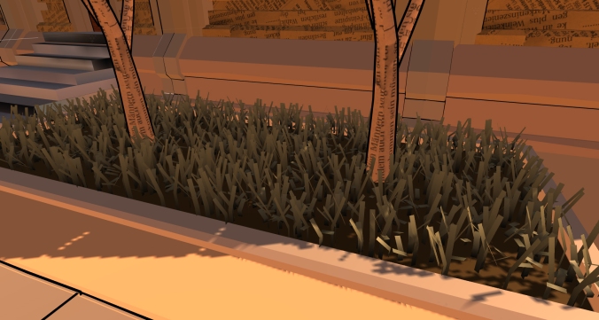
After that I spent some time on grass patches for the street. After some testing of different styles, we decided to go with a simple bended plane. After that the challenge was to find the best balance between poly density and performance, since we had a lot of issues with low frame rates in WebGL the last few weeks. We ended with a a bit more high poly solution for the grass.
[ART] New props and reworked the materials
This week we spent most of our time adapting all the new and already existing props to the texture atlas workflow.
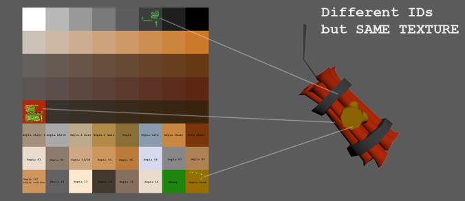
As we already had a different material for every different color, we kept track of all the names and placed them in the atlas texture (used only while unwrapping). Later inside Unity we used the same texture atlas but with a way smaller size (8×8 pixels) and no text.
In addition to this, I modeled some new interactive props like the dynamite, door keys and the locked doors. I also started with some outside props like fire hydrants or trees. For the last ones we had some problems finding the right shapes that could fit in the style of the game.
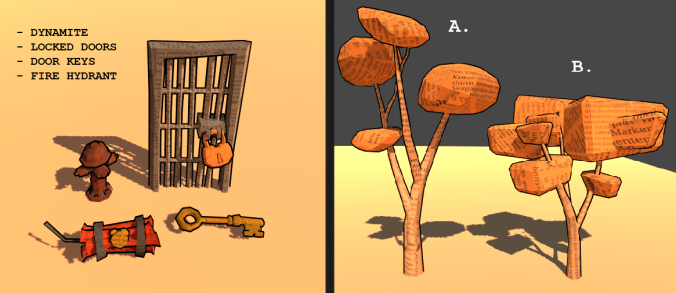
At the end we decided to go for B option, achieving a more blocky feeling. However future iterations will be made!
Step by step our level is reaching its final look!;)
[DEV] SoundManager and bugs
the last 2 weeks i finished up most of the sound implementation that still had to be done.
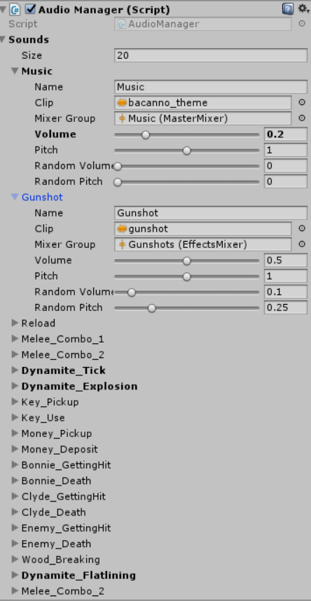
I started by making an audiomanager script that has all the sounds collected, which makes it a lot easier to tweak things now that it is all in the same place instead of individual scripts. I also linked up the audio sliders from the options menu to the Audio mixers.
besides that i just did general bug fixing and unwraps.
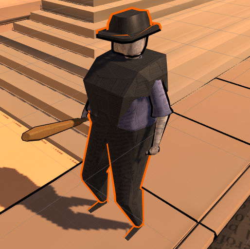
[DEV] Revamp and Bugfixes,
Last few weeks my main focus was completely revamping the way we go about defining the actors. By putting most things in a inheritance tree structure, allowed us to get rid of very inconvenient and misplaced scripts on objects. Furthermore it allowed us to finally modularly create new types of enemies, characters and actors without the need of defining new script every time.
Next to that a rework of the combat system took place. By making sure the system doesn’t check each update for inputs. We’ve minimized the update calls it makes therefore optimizing the performance. Some further work must be done there though.
Some more work was put in the dissolve shader. Now actually present in the scene. While it still dissolve quite sooner than I’d like, it gives nice feeling of being actually inside the building.
Finally small addition of armored enemy to test the waters of the revamped actor system.
[DEV] Performance, Car behaviour and UI
The past few weeks we put a lot of focus on performance. We spent a lot of time re-texturing to have most props use one atlas texture. To speed up this process we also updated some of the tools we’ve been using and spent some time figuring out what exactly Unity and 3ds MAX are doing with importing and exporting meshes, uv’s and vertex colors.
Next up we added some improvements to the *cough* realism, now police cars aren’t magically there already, they’ll come driving in and drop of police men to fight.
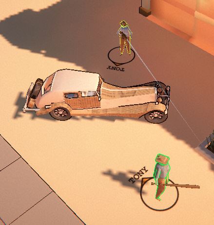
We finally addressed the issue with losing sight of Tony.
Whenever Tony is available, the players will now have a simple indicator near their feet to show in which direction Tony is.
The loading screens can now show images of ‘intel’ such as blueprints of the level, to help players with planning their robbery.
[DEV] Sound & Performance
This week I got the work on a variety of things, starting with circles around our player characters to better show where they are. 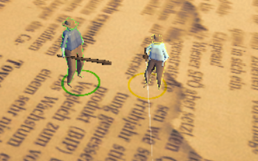
After a bit of discussing however, we decided to not use them because we don’t think it adds enough to justify adding it.
Secondly I improved the performance by disabling the second camera that is behind the first one while the game is in fullscreen. I also made sure that while in splitscreen, only the half of the camera that is being shown is drawn.
Lastly and mainly, I started implementing sound into the game. I’ve set up multiple AudioMixers that I eventually intend to link to the options menu as separate audio sliders. 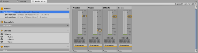
most sounds that are currently in the game are placeholder however, and are mainly there to make sure sounds play at the right time in the code and aren’t being replayed every frame.
[DEV] Performance
 This weeks area of focus was ‘Improve Performance’. We started off with some profiling and fixing some bugs one by one. As such we reduced the number of unnecessary collisions and Physics interactions. Fixing bugs also helps performance. And made the smart decision to finally turn those ‘High-End PC Graphics’ settings off for the WebGL build.
Testing both Windows PC builds and WebGL builds, we also noticed jus how big of a bottleneck WebGL is. As an example, the pc build ran at 60+fps on 4K resolution with settings maxed out, whilst the WebGL build.. could barely handle the physics.
Of course we didn’t stop there. Currently we are progressing towards a new system, which unfortunately means we’ll have to redo most of the assets.
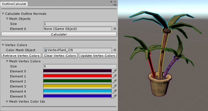
One of the issues is render batching. To solve this we need fewer materials and meshes using multiple materials.
- Unwrap using a color atlas, rather than changing color based on a different material id (less development friendly, but more performance)
- Unwrap in an extra (optional) UV channel for other detail textures
- Use Vertex Colors to define Outline Colors
- Use currently unused Tangents for Outline Avg Normals
This way we can greatly reduce the amount of materials needed and get rid of the different material ids issue completely. It slows down development of new assets and levels, but it should greatly improve performance on WebGL.
[ART] Police Concept Design
This week Pablo and I started working on the characters. I designed the police force that the players fight against.
Overall it is important that, while designing we always keep the top down view in mind, from which they will be viewed in at the end.
I started out with looking at reference of the police in the 1920s, to get a feeling of the design of the uniform. It is important that the players can clearly identify the police officers in hectic gameplay, but at the same time the era and classic uniform design should still be visible. The uniform design varies between different countries and continents. I looked at mostly english and american uniforms since these have a more traditional feeling.
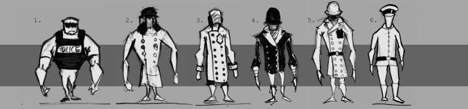
I also wanted to make sure that the police isn’t mistaken for military, since many of the uniforms in the beginning of the 20th century had a more military feeling.
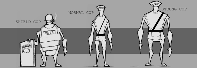
I also started playing with the proportions and overall silhouette of the characters since we will need a normal and a strong variation of the cops. Important in this is that the player can immediately distinguish which cop is the stronger version, while still keeping making clear that they are the same kind of enemy. Next to silhouette we also wanted to distinguish between them by giving them different hats, but we will iterate on that once we have the 3D model and it is actually possible to view them in-game.

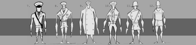
Next I started working on our vault enemy. Since these only steal money and don’t attack the player I went for very different designs, that will make it very easy to differentiate between normal enemys and vault enemys.
Here you can see two very different designs for the vault enemy. Both are more officers than normal police. During the design process for these we noticed that it would maybe be better if the vault enemy would be enemy gang members. I started designing these but I will give an update on them next week.

Last I designed the shielded cop. Once more I tried to give him a very different look to contrast the other cops. I looked at body armor from the 1920s which was mostly military armor, but I also included some parts of modern police body armor to give him the police feeling.
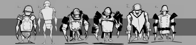
It was hard to find a good balance between too armored and not armored enough, since I want to show the function of the character in the design but at the same time not make him look like a walking metal can.
These are my final designs for the police force:
[ART]First character designs!
This week we started thinking about some possible designs for our main two characters in our game, Bonnie and Clyde! (placeholder names).
As our game is based on the cooperation between the players, we wanted our characters to feel complementary and work as a team. In order to achieve that we payed special attention to aspects like silhouette, proportions, weapons or general feeling you get from them. In addition to this we had to take into account that our game takes places in the 1920´s so all the clothing of our characters and props should fit style of those years.
As Clyde was going to be our melee character, our initial idea was giving him a bulky proportions with a big baseball bat. Therefore I exagerated the V-shape of his upper body, making a big contrast with the skinnier legs. To give him a more agresive and strong look I also exagerated the size of the forearms and lower the position of the head.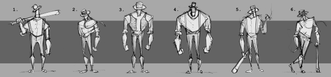
After some first sketches I decided to push a bit more the proportions and play with the big shapes of the character. By doing this I came up with some more interesting designs, being the number 12 (picture below) our favourite at the moment. 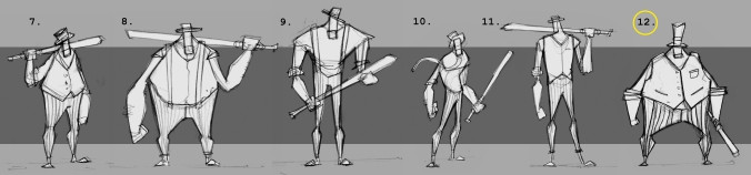
Of course this is still a work in a progress and further iterations will be made to make sure we find our perfect Clyde;)
As I started first with Clyde´s design, I tried to find good complementary shapes for Bonnie that could give a nice contrast between both of them. However, I also kept playing around and exagerating the proportions in case I found something that works better!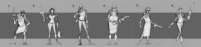
I couldn’t work on Bonnie as much as for Clyde so there´s still a lot of room for experimenting and designing. The main elements we like at the moment are the long legs and overall stance.
Even though we didnt have our final designs yet, we tried to play with the silhouettes to check what was working better. In the example below we can see that the option A is more readable and the contrast between the chacarters is bigger.

In the upcomming weeks we will continue doing some iterations on paper and start blocking out the shapes in 3D. Soon we will see this couple in action!!
